mSights is an NDA-protected project.
mSights is an industrial monitoring and predictive maintenance platform used across JLR's manufacturing environments to help engineers, technicians and operational teams monitor equipment health, identify issues early and reduce downtime.
The aim was to streamline operational workflows, improve visibility and support consistently strong OPR performance.
Manufacturing teams relied on multiple dashboards and data sources to monitor equipment performance, machine health, alerts and maintenance activity.
While large volumes of data were avalible, users often struggled to quickly identify what required attention, understand trends and move from insight to action. This is due to the fact their as-is process was focused on manual extraction of data, human intervention for interpretation and day or two worth of latency.
Different user groups also had different goals:
This created a challenge of presenting complex industrial data in a way that was both accessible and actionable.
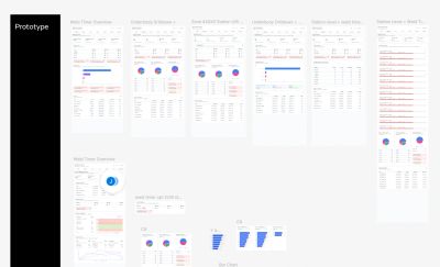
We designed a scalable dashboard experience that transformed complex machine data into meaningful insights through clear visualisations, progressive drill-down journeys and role-relevant information.
The solution provided users with visibility from facility (automation) level through to individual equipments, helping them monitor health, identify trends, investigate issues and make more informed decisions.
Lucid, Figma, Maze, JIRA, Confluence, Microsoft PowerPoint, Word & Teams.
Agile (sprints) & Design Thinking methodology.
1 UX Designer, 2 Business Analysts, 1 Project Manager, 1 Agile Delivery Lead, 1 solution architect, 4 developers, multiple stakeholders and manufacturing SMEs.
UX Designer, UX Researcher, UI Designer, Workshop Facilitator, and Workshop Host.
Built an understanding of the manufacturing environment, equipment types, user roles and existing platforms to establish a strong foundation before designing.
Collaborated with stakeholders, SMEs and end users to uncover pain points, gather requirements and identify opportunities for improvement.
Mapped user journeys and structured information architecture to support intuitive navigation from facility-level monitoring through to individual equipment insights.
Translated research findings into wireframes and design concepts that prioritised usability, information hierarchy and scalable dashboard experiences.
Refined designs through stakeholder reviews and feedback sessions, ensuring solutions aligned with user needs and business objectives.
Worked closely with developers throughout implementation to clarify requirements, validate solutions and support successful delivery.
One of the biggest challenges was understanding the manufacturing environment within JLR itself.
Unlike traditional digital products, the platform served highly specialised users including:
To design effectively, I first needed to understand how these users worked, what decision they were making and what information they required throughout their day.
I spent time reviewing the existing AS-IS experiences of the user, attending walkthrough sessions, analysing workflows and speaking with users and subject matter experts to build a clear understanding of both the technology and operational context.
Through workshops, stakeholder interviews and platform walkthroughs, several recurring themes emerged.
Key findings:
Information Overload
Users were presented with large amounts of machine data but often struggled to identify what was the most important.
Different users needed different level of detail
Senior stakeholders wanted operational summaries whilst engineers required detailed diagnostic information.
Existing journeys lacked clear hierarchy
Users could access the information they needed, but navigation between facility, area, line and machine level views wasn't always intuitive.
Alert visibility needed improvement
Critical issues could become lost amongst large volumes of information.
Following discovery, I worked with stakeholders to define a dashboard structure that balanced overview monitoring with detailed investigation.
The hierarchy evolved into:
Facility > Area > Zone > Line > Equipment
This approach allowed users to progressively drill down from a high-level operational overview into specific machine insights without becoming overly complex.
Facility view focused on:
This enabled managers and supervisors to quickly understand the state of production.
Equipment view focused on:
This supported technicians and engineers carrying out deeper investigations.
I designed a series of dashboard concepts that focused on:
Wireframes and concepts were reviewed regularly with stakeholders and users. Feedback session helped validate:
This iterative approach ensured designs remained aligned with operational needs while balancing technical constraints.

The resulting experience provided a clearer and more scalable foundation for manufacturing monitoring and predictive maintenance. The platform enabled users to:
The work also established a design framework that could be reused across future equipment dashboards and manufacturing use cases.
This project strengthened my ability to design within highly complex enterprise environments.
The biggest lesson was that successful dashboard design is rarely about displaying more data. It's about helping users understand what matters when it matters and giving them the confidence to act on it.
By investing time in discovery and understanding the manufacturing domain, I was able to move beyond designing dashboards and instead design experiences that supported real operational decision-making.
LinkedIn: https://www.linkedin.com/in/jasleen-sura-abc123/ E-Mail: Jasleen_sura@hotmailoc.uk Phone: 07778881250